How do you downplay the Antarctic sea ice gain and exaggerate the Arctic sea ice loss? Easy: compare the (change in) summer Arctic sea ice extent to the (change in) winter Antarctic ice extent, so that you're not comparing apples to apples and oranges to oranges.
Here is a tweet from Climate Reality:

You can see it's interpreted by their followers that the Arctic has lost 6 times as much sea ice as the Antarctic has gained.
If these followers weren't quite so low-info, they might realise that the present global sea ice is above average (see graphs below), and that therefore Antarctic sea ice gain is more than the Arctic sea ice loss.
Here's a screen shot from the SkS run website the tweet links to:
If these followers weren't quite so low-info, they might realise that the present global sea ice is above average (see graphs below), and that therefore Antarctic sea ice gain is more than the Arctic sea ice loss.
Here's a screen shot from the SkS run website the tweet links to:

For better a guide as to what's really happening, here is the screen shot from the Canadian Cryospheric Information Network:

Or you can go to the NSIDC interactive.
Meanwhile, the Antarctic sea ice extent is presently at a record high for the satellite measurement period:

(More here.)
Judging from the above two graphs, the current Arctic sea ice extent is about edit:half of one standard deviation less than normal for this time of year, where "normal" is a completely arbitrary standard.
Meanwhile the Antarctic sea ice extent is soaring to what looks more than two standard deviations above the arbitrary normal. So, the present Arctic sea ice loss is (very roughly) 8 times less than the Antarctic gain, not 6 times greater as claimed!
The total global sea ice is above average:
The total global sea ice is above average:

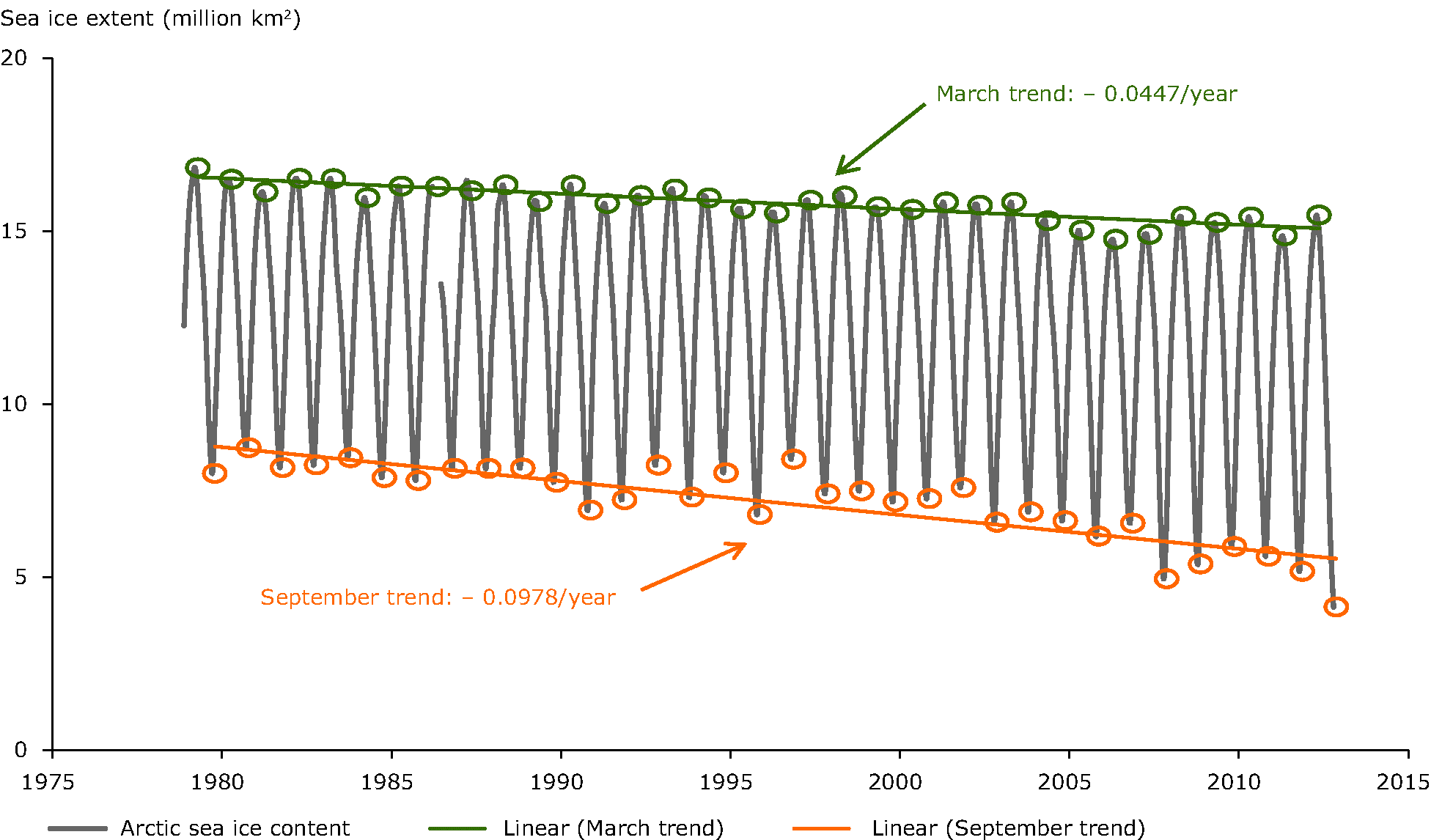
To compare summer to summer sea ice and winter to winter sea ice there's this graph from Columbia University (James Hansen) (pdf):


Notice how the winter Arctic ice has barely changed at all. And the overall ice loss is only about 15% (source):

So in order to obscure the truth, realitydrop.org compares the winter Antarctic sea ice extent change to the summer extent change in the Arctic, in order to portray a greater contrast. Not in terms of magnitude -- that's not the "trick" I refer to. But in terms of the relative change since 1979.

So because summer ice in the Arctic is varying more than the winter sea ice is varying in either the Arctic or the Antarctica, that's what SkS's realitydrop.org focuses on.

link (here)
It's a neat AGW trick.
Another trick is to cut off the Arctic sea ice graph in 2012 to hide the incline -- the modest recovery of Arctic sea ice extent in the 1 1/2 years since.
Many high profile warmist websites refuse to update their graphs to show that recovery. E.g. Greenpeace:

The warmists are determined to portray the ice loss as something that is only going to move one way (due to the inevitability of CO2-induced warming).
Skeptics prefer to view it as a snapshot in an oscillating cycle that happened to be on a downswing for the last three decades or so now.
In the longer term the Arctic sea ice variation will vary up and down, like this:

IPCC graph including a few years of pre-satellite data. The satellite era started at a high point in 1979 (red circle) -- convenient for warming scaremongering.
So it will vary conceptually something like below, where the red line is the snapshot we have from the last three decades:

In order to explain away the global sea ice gain SkS has many excuses for why Antarctica is so different to the Arctic such as: the south polar ozone hole did it.
It's funny how there are many natural reasons for why sea ice extent increases, but the only reason for Arctic sea ice loss is human-made carbon dioxide.
This mindset is epitomised by this tweet:
If you think the Earth is cooling, you're confusing weather & climate. Global warming is real @RealityDrop http://t.co/UzlNECkMoT
— Climate Reality (@ClimateReality) May 26, 2014
So it's climate when it's warming and weather when it's cooling. Got that? That's some "Climate Reality" alright!===========
One more thing, below are two a graphs of global sea ice. On the left below is a graph from Tamino which I take to be accurate. On the right below is one from Skeptical Science.

The SkS one on the right isn't a great match for the accurate one on the left, even if it is smoothed. It would be nice to know how SkS got that particular graph, it seems dodgy.
No comments:
Post a Comment